omunto
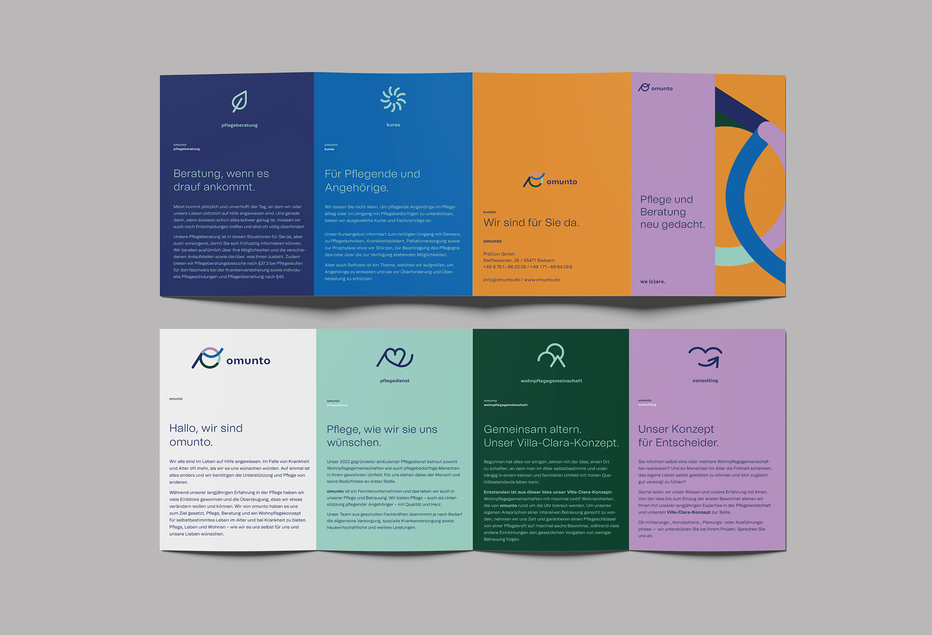
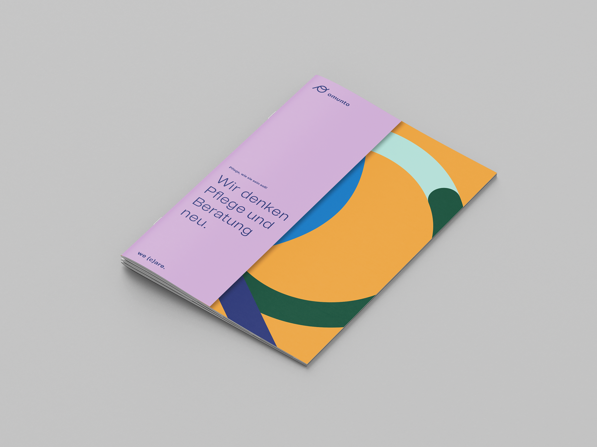
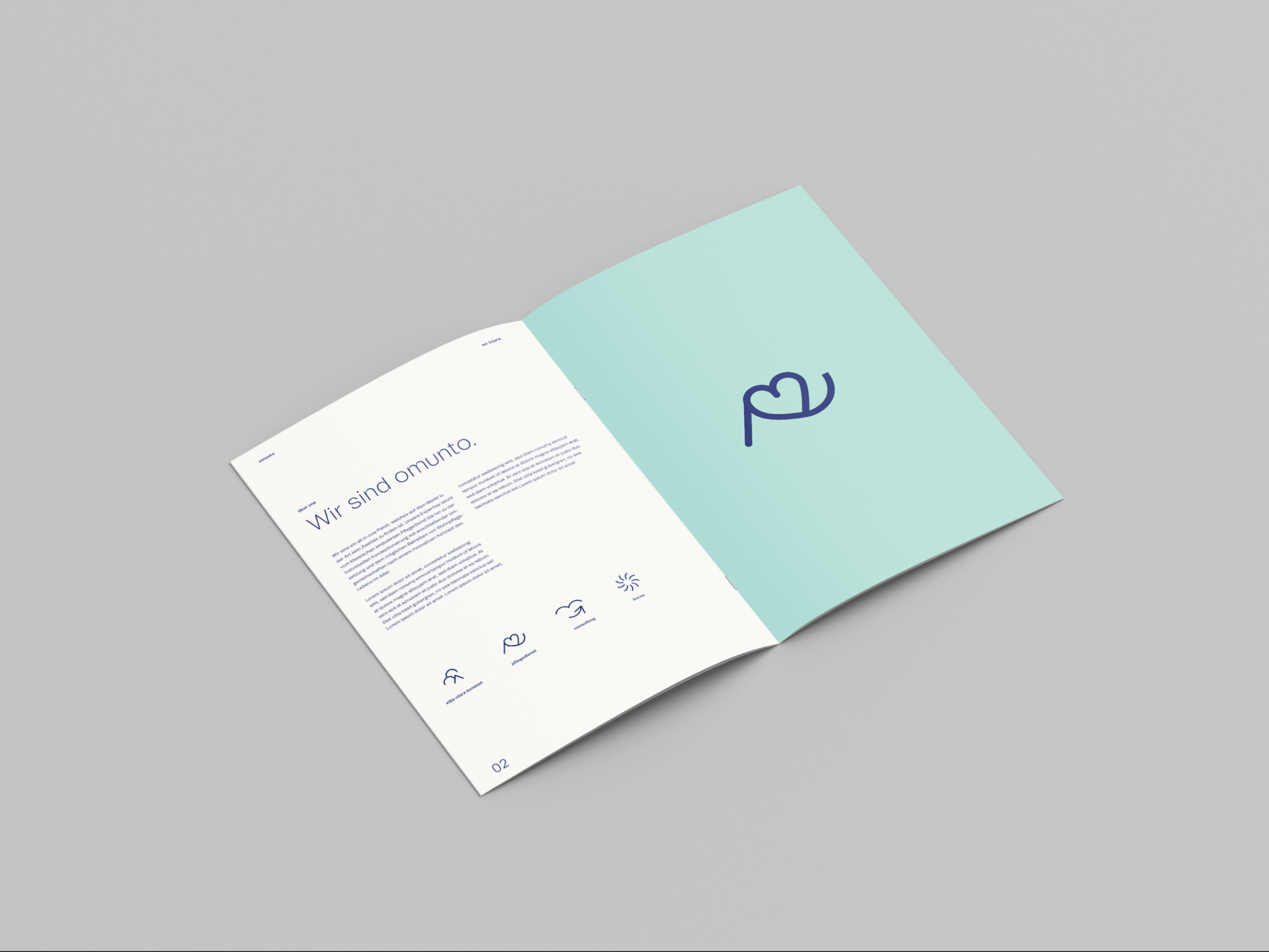
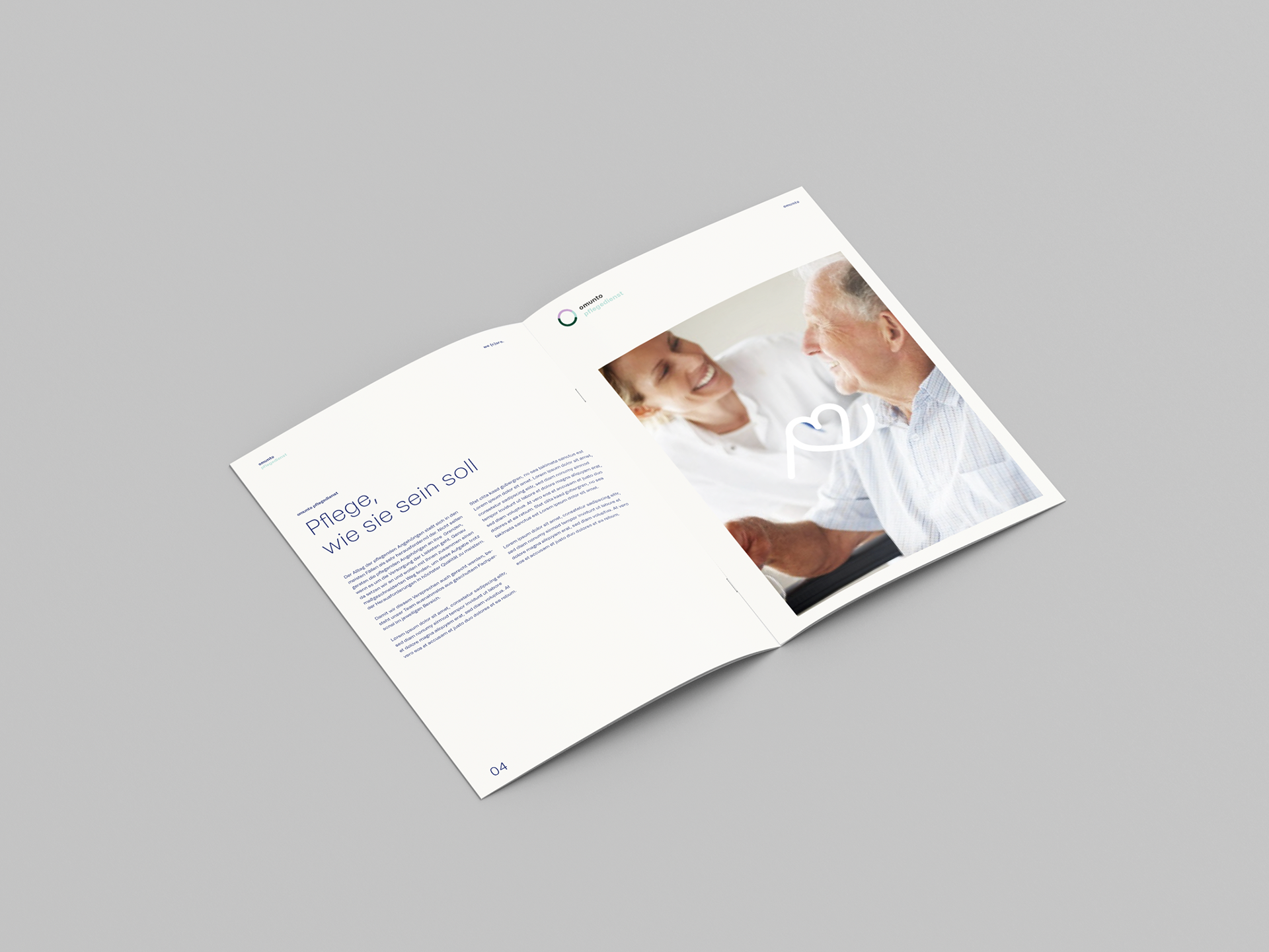
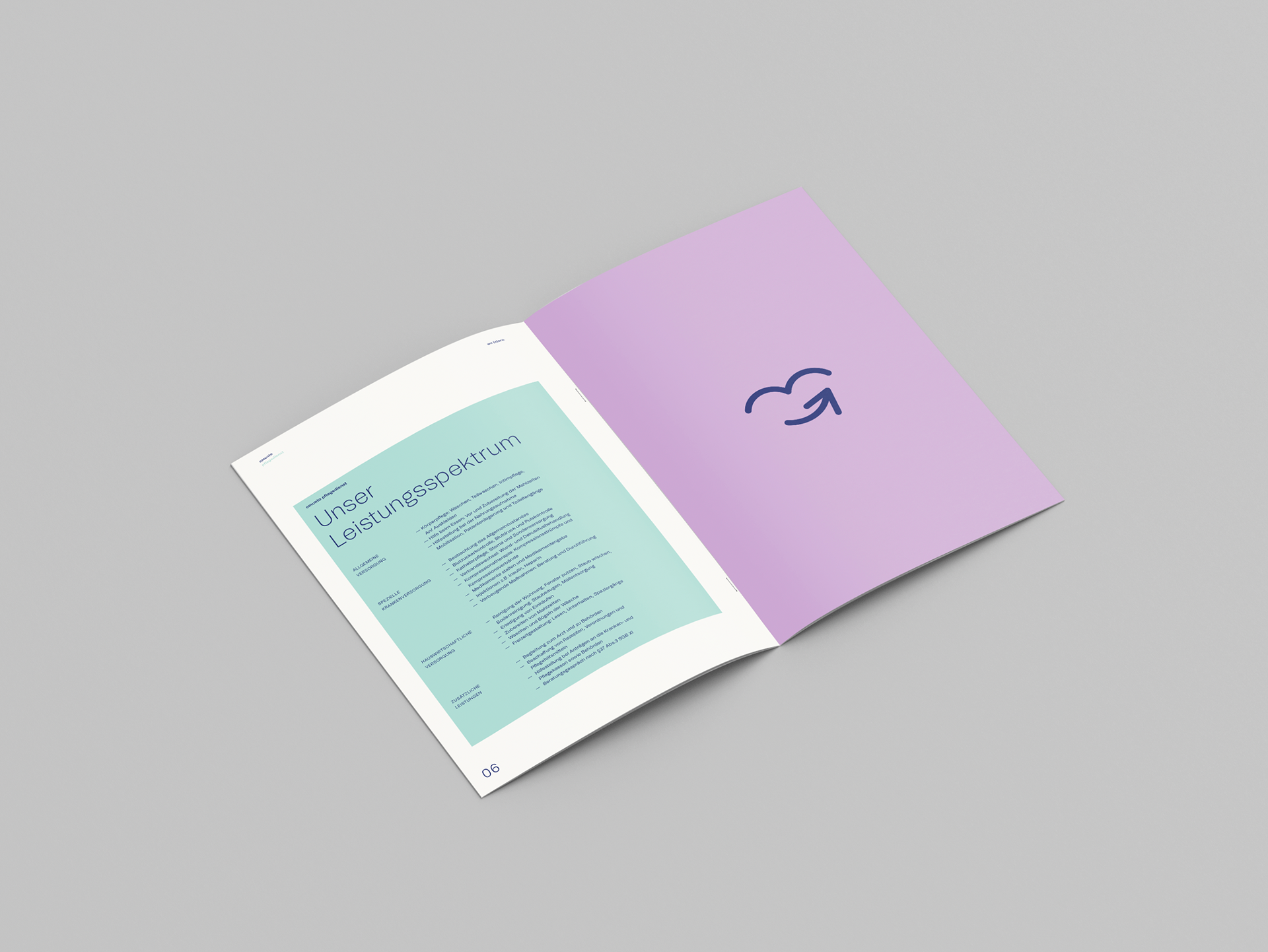
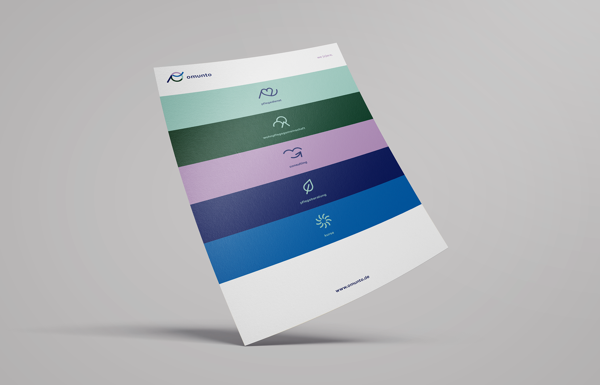
I developed a new visual identity for omunto — a company specialising in care services, residential care communities, care advice, consultancy and training courses.
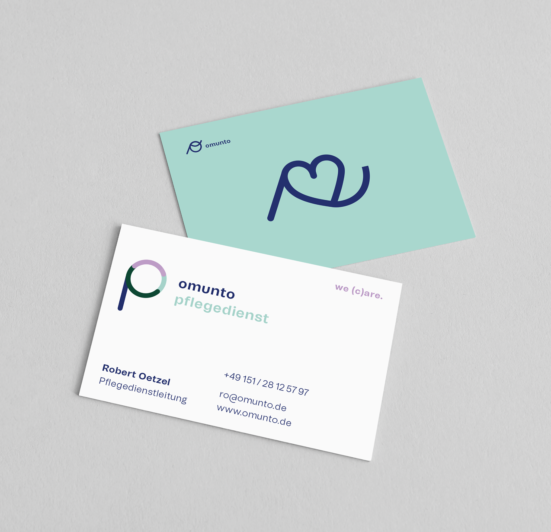
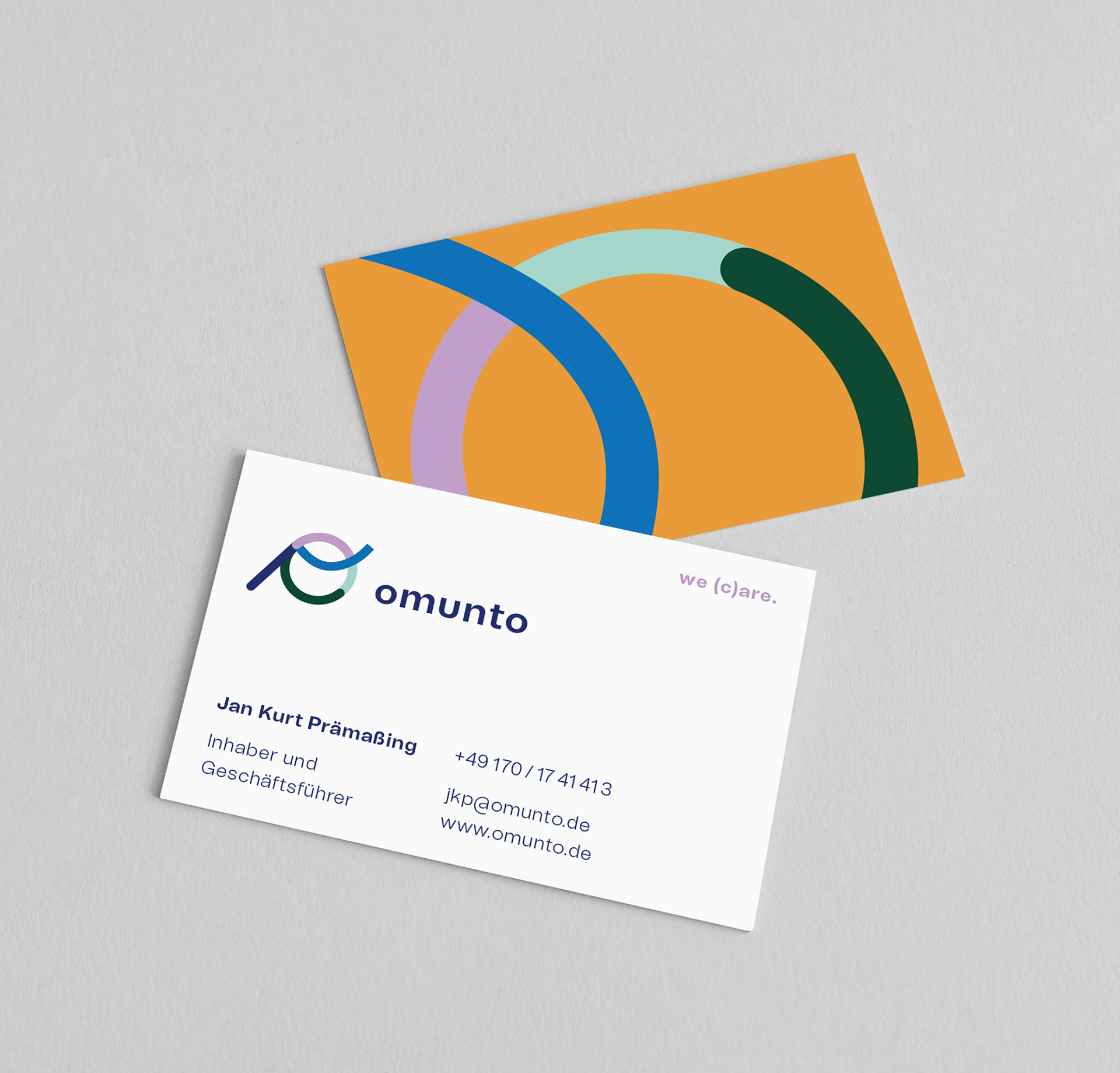
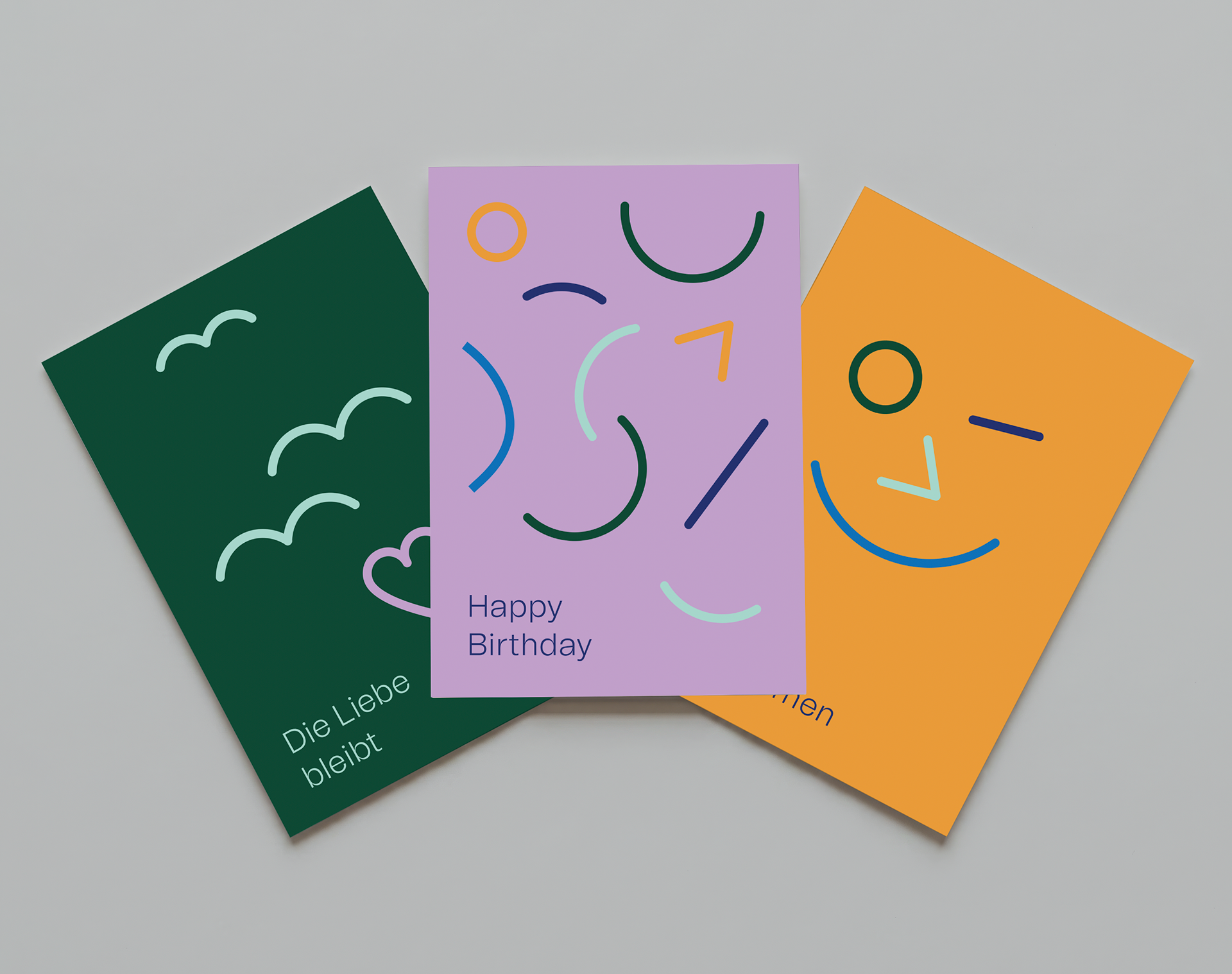
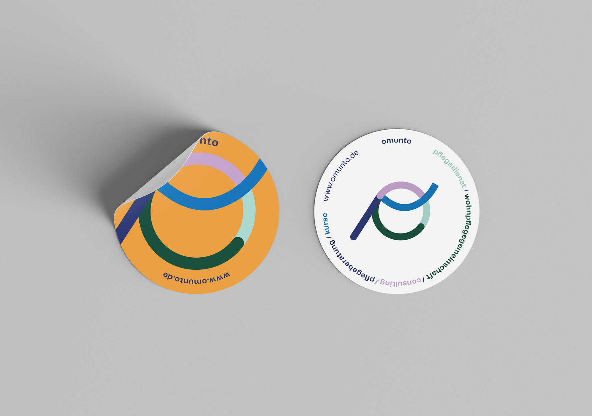
The focus of the project was on the challenge of clearly distinguishing the different service areas from one another whilst ensuring they were recognisable as part of a single brand. To achieve this, a flexible design system was created, derived from the elements of the ‘O’ in the logo. Depending on the context, these building blocks can be combined in various ways, thereby providing clarity, recognisability and a strong visual connection.